📝 Summary
整理自 X 的真人转插画案例提示词,保留左右分栏、原图保真、右侧手绘涂鸦、留白与文字排版限制。
🎨 Chinese Prompt
请将我上传的每张照片分别处理为独立的高端设计海报,不要多图拼接,每张照片单独输出。整体采用 16:9 横构图,左侧保留原图,右侧进行涂鸦插画处理。
左侧原图需完整保留,保持主体身份、结构、姿态、真实质感、自然光影与原始色彩氛围,只做轻微的高级调色,呈现艺术杂志和展览图像的质感。为适配画幅,可自然延展环境背景,但主体不能被拉伸、变形或改动。
右侧进行新的艺术判断,只提取照片中最有识别度的主体、轮廓、结构、姿态和叙事关系,重构为手绘涂鸦生活插画 / 朴拙插画 / 马克笔绘画。不要保留全部物体,不要复制原始场景;主动删减大部分背景和无关信息,通过删除、重组、裁切和比例变化重新组织画面,让普通构图也能转化为有效作品。
造型应简化、符号化、松弛且个性化,使用略微抖动、间歇、不完全规整的手绘线条,以及马克笔、蜡笔、油画棒般的自然上色。允许轻微线条交叠、留白和手工误差,不追求写实比例、完整透视或细节刻画。
右侧以大量有意识留白为核心,实色图形只占很小比例,其余空间主动留空。主体可以偏角、贴边、悬浮或局部裁切,位置由姿态方向与视觉重心决定。留白与主体共同形成正负形、距离、停顿和呼吸感,宁可少画也不要填满画面。
图形与文字必须作为整体重新编排,而不是简单地“上面一行字、下面一个形”。先建立无形网格、视觉轴线和阅读路径,再决定文字位置;文字可以贴近主体轮廓、顺着动作方向、对齐头部或肩线、落入大块负空间,或与图形形成错位、穿插、非对称呼应。避免机械居中、上下堆叠和固定模板,让图形负责情绪,文字负责节奏,两者共同完成构图。
文字不限制语言,只保留极少量真正有意义的词语或短语。使用轻盈、自然的手写字体,字宽和笔画压力略有变化,保留一点随手书写感,但字间距、行距和整体位置必须通过编辑设计控制。可用一个稍微醒目的短句配合微小辅助文字形成层级,但不要使用菜单式标题、长文案或整页文字。
颜色采用柔和、明亮、疗愈的限定色盘,从原图中提炼最关键的颜色,重组为奶油黄、桃粉、珊瑚红、天蓝、湖蓝、嫩绿、淡紫等清新色彩;鲜艳但不刺眼,柔和但不脏灰,并以暖白或极浅复合色作为大面积呼吸空间。
整体追求朴拙绘画、成熟构图、聪明的图文关系和大量留白,像高端独立杂志、生活方式编辑插画或艺术出版物,而不是儿童涂鸦本。避免固定的居中主体加居中文案、随意散落的小图标、复杂背景、信息堆砌、塞满画面、廉价卡通感和模板化排版。
当前用户确认的编辑规范,优先于上方冲突的排版要求:
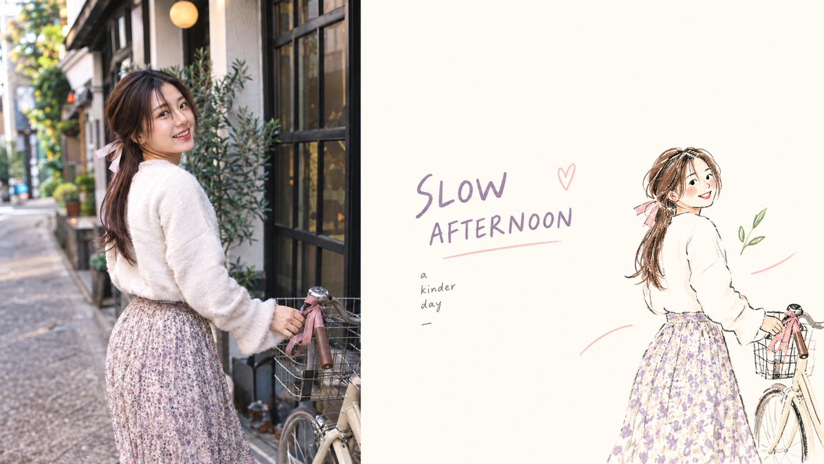
横向 16:9,左侧原图、右侧涂鸦等分。右侧保留小个子女性形象,粉色发带、白色毛衣、花朵裙摆和简化自行车轮廓,右侧画面占比约 20%,使用三条受控的手势线,整体以奶油色留白为主。文字为 SLOW AFTERNOON。
原图面板必须忠实保留,不要拉伸。输入图像为 AI 生成,不是真实照片。不要额外人物,不要男性角色或男性手部。
🎨 English Prompt
Please process each uploaded photo as an independent high-end design poster. Do not stitch multiple images together; output each photo individually. Use a 16:9 horizontal composition overall, with the original image on the left and doodle illustration treatment on the right.
The left original panel must be preserved faithfully, keeping the subject’s identity, structure, posture, real texture, natural light and shadow, and original color atmosphere, with only slight high-end color grading to give it the texture of art magazines and exhibition images. To fit the frame, the environmental background may be naturally extended, but the subject must not be stretched, distorted, or altered.
The right side should make a new artistic judgment, extracting only the most recognizable subject, outline, structure, posture, and narrative relationship from the photo, and reconstructing it as hand-drawn doodle lifestyle illustration / naïve illustration / marker drawing. Do not retain all objects, do not copy the original scene; actively remove most of the background and irrelevant information, and reorganize the image through deletion, restructuring, cropping, and scale changes so that even an ordinary composition can become a valid work.
Modeling should be simplified, symbolic, relaxed, and personalized, using slightly jittery, intermittent, and not fully regular hand-drawn lines, along with natural coloring like markers, crayons, and oil pastels. Allow slight line overlap, whitespace, and manual imperfections, without pursuing realistic proportions, complete perspective, or fine detail.
The right side must be centered on a large amount of intentional whitespace, with solid graphics occupying only a small proportion and the rest of the space actively left blank. The subject may be eccentric, edge-aligned, suspended, or partially cropped, with placement determined by posture direction and visual center of gravity. Whitespace and the subject should together create positive and negative shapes, distance, pauses, and a sense of breathing; paint less rather than fill the screen.
Graphics and text must be retypeset as a whole, rather than simply “text on top, one character below.” Establish an invisible grid, visual axis, and reading path first, then determine text placement; text can be close to the subject’s outline, follow the direction of movement, align with the head or shoulder line, fall into large negative spaces, or form staggered, interspersed, asymmetric echoes with the graphics. Avoid mechanical centering, top-to-bottom stacking, and fixed templates; let graphics handle emotion and text handle rhythm, with both completing the composition together.
Text has no language restriction and should retain only a very small amount of truly meaningful words or short phrases. Use light, natural handwritten fonts with slight variations in character width and pen pressure, keeping a casual writing feel, but letter spacing, line spacing, and overall placement must be controlled through editorial design. One slightly prominent short phrase may be used with tiny auxiliary text to form a hierarchy, but avoid menu-style titles, long copy, or full-page text.
Use a soft, bright, healing limited palette, remodulating the most essential colors extracted from the original image into refreshing tones such as cream yellow, peach pink, coral red, sky blue, lake cyan, tender green, and lavender purple; vivid but not glaring, soft but not dirty gray, with warm white or extremely light composite colors as large breathing areas.
Overall, pursue naïve drawing, mature composition, smart text-graphic relationships, and a massive amount of whitespace, like high-end independent magazines, lifestyle editorial illustrations, or art publications, rather than children’s scrapbooks. Avoid fixed structures of centered subject plus centered copy, randomly scattered small icons, complex backgrounds, information accumulation, filling the screen, cheap cartoonishness, and templated layouts.
Current user-approved edit spec, overriding conflicting layout above:
Horizontal 16:9, equal left original and right doodle. Small woman with pink ribbon, white sweater, floral skirt and loose bicycle outline, 20% occupied right-panel area, three controlled gesture lines, cream whitespace. Text SLOW AFTERNOON.
Preserve the original image panel faithfully, no stretching. The input image is AI-generated, not a real-world photograph. No extra people, no male characters or male hands.
📷 Images