📝 Summary
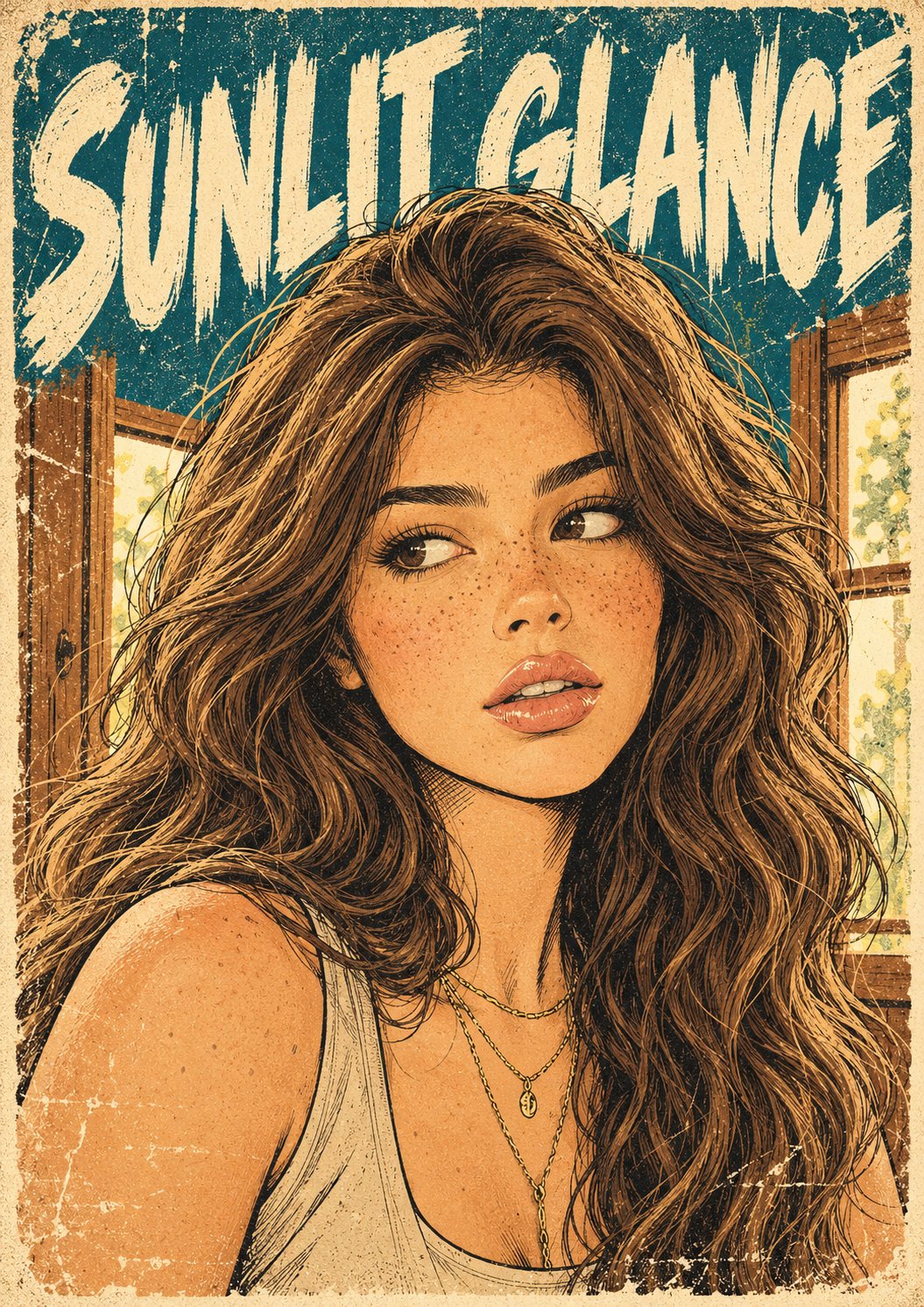
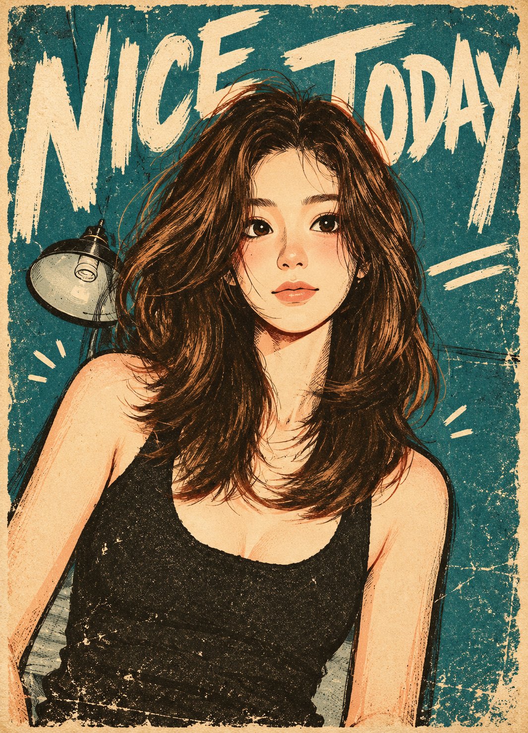
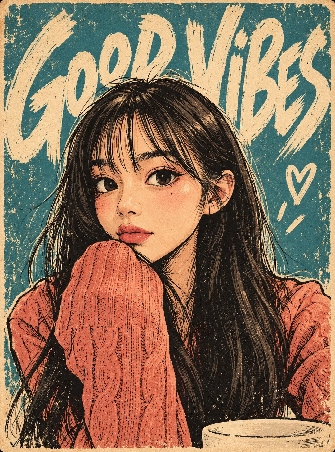
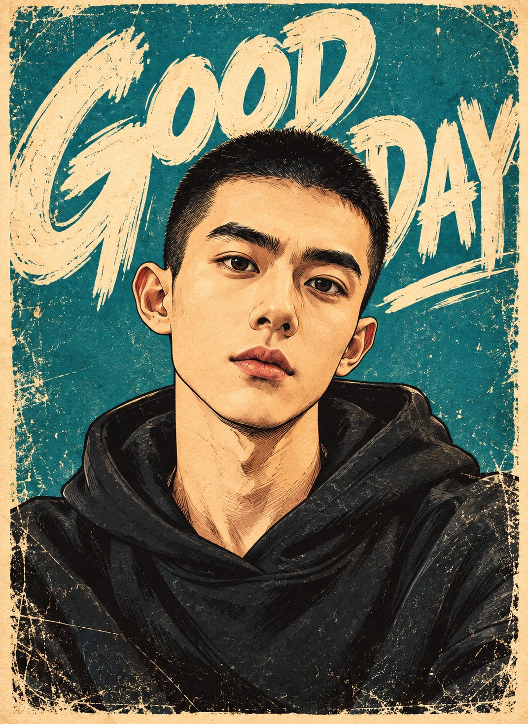
整理为地下漫画风格的半身照海报生成提示词,保留粗粝印刷质感、夸张人物比例和复古限色排版。
🎨 Chinese Prompt
保守整理后的中文提示词:
使用上传的单张照片作为主体唯一来源,将其转换为一张大胆的复古插画角色海报,融合表现性编辑漫画夸张风格、地下漫画墨线绘制和做旧丝网印刷质感,印在旧化的奶油色纸张上。只输出一张完成后的转化海报。
保留原图的主要主体、可识别的发型、胡须、肤色倾向、年龄和性别呈现、标志性配饰、服装类别、代表性色彩、姿势、手势以及与现有物体的互动。保持原图的头部角度和整体视角。通过这些线索而不是精确面部测量来保留身份特征。允许大幅卡通化重塑眼睛、眉毛、鼻子、脸颊、下颌和嘴巴。成年人仍应保持成年感,同时具备夸张、俏皮的比例。
绘制略微放大的头部、宽阔的上半脸、明显的脸颊形状和收窄的下半脸。眼睛要显著放大,呈细长杏仁形,带有温暖的象牙白眼白、深色虹膜和明确的黑色上眼睑。将瞳孔放在与原图视线一致的位置,必要时强调偏侧或向上看的视线。保留与原表情一致的眨眼或半眯眼状态,避免统一的睁眼凝视。使用有力度的眉毛、用少量墨线和一个角度化的暖色阴影概括鼻子,并用自信曲线绘制独特的嘴部。根据人物保留闭嘴、微笑、微张嘴等表情,不要强行套用同一种笑容。露出牙齿时,仅用简单的象牙色形状表示。根据人物调整睫毛、唇部强调、胡须线、雀斑和面部细节,不要套用千篇一律的脸。
在轮廓、头发、眼睛、服装和重要物体周围使用强烈且自然变化的黑色墨线。内部阴影区域加入更细的毛糙笔线、短方向排线和局部交叉排线。头发应由大块流动发束和深色团块构成,辅以有生命力的弧形墨线和少量暖色高光。保留原有发型和色系。面部毛发用紧凑深色块面和短粗线表现。服装通过大色块、清晰褶皱和少量有节奏的笔触来概括。用少量平面阴影块建立体积,不使用摄影式渐变。
使用紧凑的印刷色板:旧化象牙白、接近黑的炭黑、温暖赭石或桃色肤色、棕色,以及少量人物特定点缀色,如灰粉、番茄红、芥末黄、低饱和薄荷绿或汽油青蓝。保留原图中可识别的颜色,但转换为有冲击力的复古印刷色。默认使用强烈的汽油青蓝背景;如果更适合主体气质和服装,也可使用深炭黑背景。保持人物与背景清晰分离。肤色应表现为温暖的图形色块,带克制的脸颊红润和墨线细节,而不是柔软的空气刷肖像阴影。
在人物和背景上都加入真实的旧印刷质感:可见纸张纤维、细颗粒、零星掉墨、略不均匀的墨层、刮擦色块、干刷边缘和轻微褪色区域。保持底下的绘画清晰可读。添加一圈狭窄、不规则的旧纸边缘,边角磨损,墨边有擦伤。整体应像印在吸墨纸上的老插画海报,呈现哑光平涂和触感瑕疵,而不是光亮的数字渲染。
让主角在前景中占据主导。保留原图可见的身体范围和核心手势,将构图适配为竖版海报,不要凭空添加未见的手、腿或道具。在上方背景放置一行超大号奶油色标题,部分被人物头发或轮廓遮挡。标题应为粗糙的全大写手绘刷字,字宽不一、间距不规则、斜向强烈、刷痕边缘毛糙并有缺墨。让文字横跨海报大部分宽度,同时保持脸部不被遮挡。保留足够的字形结构以便短语仍可辨认。
可选标题:[TITLE]。可选小号手写注释:[NOTE]。按提供文本原样呈现。如果 TITLE 为空或省略,则生成一个两到四个英文单词的短语,表达原图的情绪或动作。如果 NOTE 省略,则根据空间补充一句简短的相关手写说明,或在空间有限时省略。不要显示占位符。不要自动复制其他图片的口号,不要引入脏话,也不要为主体编造个人身份声明。
将原始场景简化为少量大胆的插画环境形状。只加入少量相关外围细节,例如与来源相关的物体、胶带纸条或两到三个快速手绘强调标记。它们必须次于人物和标题。不要在没有来源支持或明确要求的情况下,自动增加咖啡、植物、猫、珠宝、星星、家具或新的手势。
优先表现有张力的卡通面部结构、利落的黑色墨线、大胆的限色块、超大号刷字排版和真实的做旧印刷效果。避免写实面部几何加纹理滤镜、精致粉彩娃娃风、标准精修二次元、小比例Q版身体、平滑矢量描边、水彩晕染、光泽空气刷、摄影背景、3D渲染、过度装饰、额外主体、畸形手部、签名、水印和界面元素。只输出完成的插画海报,不要保留原始照片或对照布局。
🎨 English Prompt
Conservatively organized English prompt:
Use the single uploaded photograph as the sole source for the subject. Transform it into a bold vintage illustrated character poster combining expressive editorial caricature, underground comic ink drawing, and distressed screen printing on aged cream paper. Output one finished transformed poster only.
Preserve the principal subjects, recognizable hairstyle, facial hair, skin-tone family, age and gender presentation, distinctive accessories, clothing categories, signature colors, pose, gesture, and interaction with existing objects. Keep the source head angle and general viewpoint. Preserve identity through these selected cues rather than exact facial measurements. Allow substantial cartoon redesign of the eyes, brows, nose, cheeks, jaw, and mouth. Keep adults visually adult while giving them expressive, playful proportions.
Draw a slightly enlarged head with a broad upper face, prominent cheek shapes, and a compact tapered lower face. Make the eyes conspicuously large, elongated almond shapes with broad warm-ivory whites, dark irises, and decisive black upper eyelids. Position the pupils clearly toward the source gaze direction, emphasizing an off-center sideways or upward glance when appropriate. Keep a wink or narrowed eye consistent with the original expression. Avoid a uniformly wide-eyed stare. Use strong expressive eyebrows, a simplified nose defined by a few ink marks and one angular warm shadow, and a distinctive mouth drawn with confident curves. Preserve a closed mouth, grin, parted lips, or other expression without imposing the same smile on everyone. Suggest teeth as simple ivory shapes when visible. Adapt lashes, lip emphasis, beard marks, freckles, and facial details to the person instead of applying one generic face.
Use strong, organically varied black ink contours around the silhouette, hair, eyes, clothing, and important objects. Add finer scratchy pen lines, short directional hatching, and selective cross-hatching inside shadow areas. Hair should consist of large flowing locks and dark masses with lively curved ink strokes and a few warm highlights. Preserve the actual hairstyle and color family. Render facial hair with compact dark shapes and short rough strokes. Describe clothing through broad color regions, clear folds, and sparse energetic pen marks. Build volume with a few flat shadow shapes rather than photographic gradients.
Use a compact palette of opaque printing inks: aged ivory, near-black charcoal, warm ochre or peach skin tones, brown, and a few character-specific accents such as dusty pink, tomato red, mustard, muted mint, or petrol turquoise. Preserve recognizable source colors while translating them into punchy vintage ink colors. Default to a strong petrol-turquoise background; use deep charcoal when it better supports the source mood and clothing. Keep the figure clearly separated from the background. Skin should read as warm graphic color with restrained cheek blush and ink detail, not softly airbrushed portrait shading.
Apply convincing worn-print texture across both figure and background: visible paper tooth, fine grain, scattered missing-ink flecks, slightly uneven ink coverage, scratched color areas, dry-brush edges, and lightly faded patches. Maintain crisp readable drawing underneath the distress. Add a narrow irregular aged-cream paper margin with worn corners and scuffed ink edges. The artwork should resemble an old illustrated poster printed on absorbent paper, with matte flat colors and tactile imperfections rather than glossy digital rendering.
Make the main character dominant in the foreground. Preserve the source’s visible body range and essential gesture, adapting the composition to a vertical poster without inventing unseen hands, legs, or props. Place an oversized cream headline across the upper background, partially behind the character’s hair or silhouette. Draw the headline as rough uppercase hand-painted brush lettering with uneven widths, irregular spacing, strong diagonals, ragged dry-brush ends, and visible missing ink. Let the words span most of the poster width while keeping the face unobstructed. Preserve enough letter structure for the phrase to remain readable.
Optional headline: [TITLE]. Optional small handwritten note: [NOTE]. Reproduce supplied text exactly. If TITLE is blank or omitted, generate a short two-to-four-word English phrase expressing the source image’s mood or activity. If NOTE is omitted, either add one brief context-related handwritten note or omit it when space is limited. Never display placeholders. Do not automatically copy slogans from other images, introduce profanity, or invent personal claims about the subject.
Simplify the original setting into a few bold illustrated environmental shapes. Include only a small selection of relevant peripheral details, such as a source-related object, a taped paper note, or two or three quick hand-drawn accent marks. Keep these secondary to the character and headline. Do not automatically add coffee, plants, cats, jewelry, stars, furniture, or a new hand gesture unless supported by the source or explicitly requested.
Prioritize expressive cartoon facial construction, confident black ink drawing, bold limited-color shapes, oversized brush typography, and authentic distressed printing. Avoid realistic facial geometry with a texture filter, delicate pastel doll styling, standard polished anime, tiny chibi bodies, smooth vector outlines, watercolor washes, glossy airbrushing, photographic backgrounds, 3D rendering, excessive decoration, extra subjects, malformed hands, signatures, platform watermarks, and interface elements. Output only the completed illustrated poster, with no original photograph or comparison layout.
📷 Images