#552Vertical Chinese retro educational infographic poster design: one-click packaging, ready to use out of the box.
2026-01-04 X / Berryxia.AI
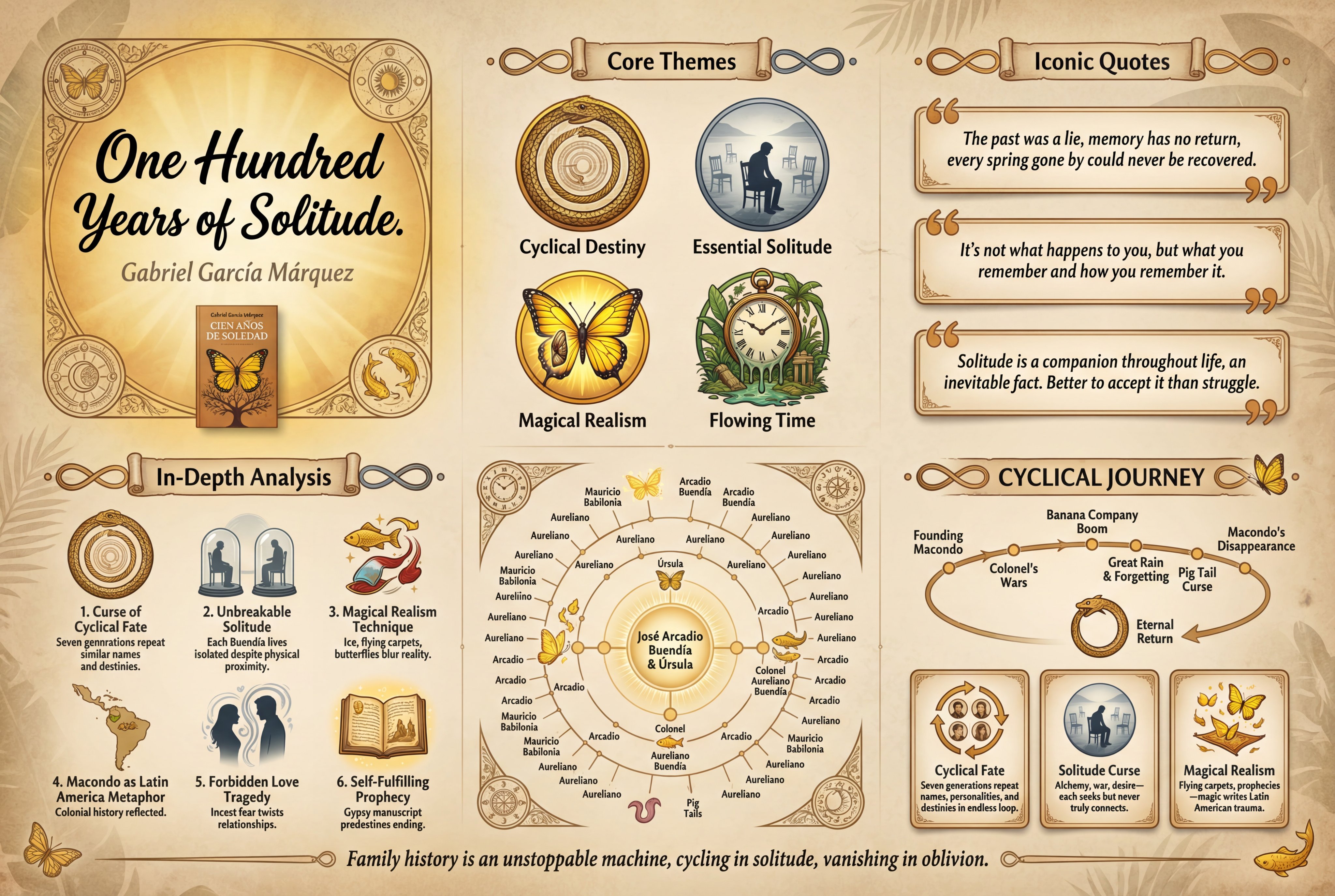
📝 Summary
This tweet describes a design specification for a vertical, traditional Chinese retro-style educational infographic poster, including modules such as core theme, classic quotes, six core viewpoints, a relationship map, a timeline and character cards, and other components. It emphasizes unified typography, white space ratio, high-resolution output, and bidirectional vertical/horizontal adaptability, making it suitable for large-format display and exhibition use.
🎨 Chinese Prompt
一张高质量的竖版教育信息图海报,采用传统的中国复古风格,由[作者/创作者]为[主题/书籍标题]设计。
【版本 5.0 - 最终稳定版,中文文本清晰度已得到验证】
背景:
- 径向渐变背景营造出微妙的暗角效果,中心较亮,边缘逐渐变暗。
- 纹理纸表面,可见天然纤维图案,营造出真实的复古感
画布上散布着细微的岁月痕迹。
- [可选:主题的具体纹理说明]
头部区域(顶部区域):
- 顶部中央醒目的粗体书法标题,采用[书法风格]:[中文主标题]
风格:【颜真卿/欧阳询/行书】
颜色:深黑色,以实现最大对比度和清晰度
- [如有需要] 精简版辅助脚本字幕:[字幕]
明显更小,中灰色
- 作者姓名(优雅小写):[作者/创作者姓名]
小巧精致,暖灰色
- 右上角的小矩形视觉元素:
* 优先级 1:逼真的已出版书籍封面,书名和作者清晰可见
* 优先级 2:核心主题的风格化插图
* 优先级 3:象征性意象
- 角饰:[具体图案名称]
微妙的透明感,优雅的传统设计
第 1 部分 - 核心主题(核心主题,上第三区域):
- 华丽的滚动式节标题,带有文字“核心主题”
- 装饰性页眉末端:[特定样式]
- 四个醒目的大图标水平排列,间距宽敞:
* 图标 1:[简明视觉描述],带标签[关键词 1] - 强调色:[颜色 + 含义]
* 图标 2:[简明视觉描述],带标签[关键词 2] - 强调色:[颜色 + 含义]
* 图标 3:[简明视觉描述],带标签[关键词 3] - 强调色:[颜色 + 含义]
* 图标 4:[简明视觉描述],带标签[关键词 4] - 强调色:[颜色 + 含义]
图标间距均匀,留有舒适的呼吸空间。
- 引言段落(一句简洁明了、长度适中的句子):
【精华概述 - 约 30-50 个字符,提供背景信息】
第 2 部分 - 经典语录(引文部分,重点区域):
- 华丽的卷轴式章节标题
- 三个矩形引用框垂直排列,间距舒适:
每个方框:柔和的对比背景,精致的边框,淡淡的阴影
* 内部衬垫充足
* 大型装饰性引号
* 完整引文(保留文学价值):
- 引文 1:[完整引文 - 16-25 个字符,完整且有意义的句子]
- 引文 2:[完整引文 - 16-25 个字符]
- 引文 3:[完整引文 - 16-25 个字符]
- 箱子之间舒适的垂直间距
第 3 节 - 核心观点(关键点分析,主要内容区域 - 完整深度):
- 华丽的滚动式章节标题,带有文字“核心观点”
- 六项网格,2 列 x 3 行
- 非对称布局,营造视觉节奏感:
* 项目 1、3、5:图标在左,文字在右
* 第2、4、6项:文字在左,图标在右
每个项目:中等大小的图标 + 带有中等深度的编号点
- 平衡的文本(足够的深度,但不要过于拥挤):
* 项目 1:[图标说明] + “1. [标题 - 4-8 个字符]。[核心内容 - 28-35 个字符]”
* 项目 2:[图标说明] + “2. [标题]. [图例说明 - 28-35 个字符]”
* 第 3 项:[图标说明] + “3. [标题]。[要点 - 28-35 个字符]”
* 第 4 项:[图标说明] + “4. [标题]。[简要分析 - 28-35 个字符]”
* 第 5 项:[图标说明] + “5. [标题]。[简要摘要 - 28-35 个字符]”
* 第 6 项:[图标说明] + “6. [标题]。[简短介绍 - 28-35 个字符]”
项目之间留有足够的间距,使文本能够舒展呼吸。
底部区域分割(极简主义视觉叙事方法):
左下 - 关系图谱(关系图):
- 华丽的卷轴式章节标题
- [结构类型:六边形网络/圆形环/树状图]
- 中心节点:[主要元素] - 最大、最突出
- 连接的卫星节点:[次要元素] - 中等大小
- 外环节点(如适用):[三级元素] - 较小
- 仅限名称 - 图表内不得包含任何描述性文字
连接线表示关系,粗细不同表示强度。
让视觉网络结构讲述故事
右下 - 时间线与人物(时间线和人物 - VISUAL FOCUS):
- 华丽的卷轴式章节标题
时间轴部分(本区域的上半部分):
- 基于图标、文字极少的时轴:
* [4-5 个关键里程碑] 由优美的弧线或曲线连接
每个里程碑均以独特的插图图标表示。
*仅限简短时期标签(例如:“元妃省亲”/“1950s”/“第三章”)
* 无需冗长的描述,无需括号内的解释
* 让图标以视觉方式叙述旅程
* 弧形或曲线形状暗示故事发展
角色/主题卡(下半部分,视觉主导):
三张设计精美的卡片,边框呈拱形或精致形状。
- 视觉聚焦策略:
主要元素:清晰的大幅肖像或象征性插图
* 次要元素:仅限角色名称或主题标题
* 无需赘述段落——肖像本身就能讲述故事。
- 卡牌结构:
* 卡片 1:[详细肖像描述] + 大号清晰姓名/职称:[姓名/职称]
* 卡片 2:[详细肖像描述] + 大号清晰姓名/职称:[姓名/职称]
* 卡片 3:[详细肖像描述] + 大号清晰姓名/职称:[姓名/职称]
卡片之间留有足够的间距。
- 人像占据了卡片的大部分空间,营造出视觉画廊的效果。
页脚(最小空间):
- 纤细优雅的水平隔断,中心饰有装饰图案
- 鼓舞人心的结束语(一句话):[结束语]
- 零星点缀的精致装饰元素,极浅的透明度
【风格与美学 - 稳定性优化】
艺术风格基础:
- 线条精致的扁平化矢量插图
极简主义符号蕴含文化内涵
- 海报所有中文文本均使用统一的中文字体:思源宋体 (Noto Serif CJK SC) 或 Source Han Serif SC。
- 优雅的衬线字体,醒目的书法标题
- 平衡且留白充足的空间
颜色选择:[请选择一项]
*经典暖色调/清冷色调/优雅水墨/自然禅意/定制*
装饰元素:[请根据主题具体说明]
- 边框:双线边框,宽阔的边距
- 角部:[具体图案名称及描述]
- 章节分隔符:[特定样式]
- 纹理:纸张纹理、晕影、[主题特定纹理]
排版——中日韩一致性至关重要:
所有中文文本均使用相同的 CJK 优化字体(Noto Serif CJK SC 或 Source Han Serif SC),以确保一致的渲染质量
- 标题:特定风格的粗体书法(严振青/欧阳迅/行书)
- 章节标题:中等大小的传统字体,配以卷轴装饰
正文:清晰舒适的 CJK 优化松帛字体
- 说明文字:使用简洁的小字体,提供辅助信息
- 底部章节名称:采用特大号和粗体,以确保最大程度的清晰度
文本分发策略:
海报前70%:信息深度完整
* 核心主题及其背景
* 完整的文学引文
* 全面的关键点分析
海报下半部分(30%):文字极少,视觉效果占主导地位
* 关系图:仅名称
* 时间轴:带有简短标签的图标
* 角色卡:仅包含头像和姓名
留白管理:
大约有百分之三十八到百分之四十的负空间
底部留白格外宽裕
- 充足的间距,优先保证文本的绝对清晰度
- 整个空间都拥有舒适的呼吸空间
质量标准:
- 高分辨率,适用于大幅面打印(建议竖幅打印使用 4K 分辨率)
- 竖屏(2:3)或横屏(16:9)方向
- 线条清晰锐利,曲线流畅优美
采用极简底部设计,保证文字零模糊。
- 博物馆展览标准展示
--ar [2:3 代表竖屏 / 16:9 代表横屏] --v 6.1 --q 2 --style raw
——无模糊、失真、像素化、可见测量数据、技术注释、重复的时间线文本、角色卡片中的描述性文本、底部过多的文本、难以辨认的小汉字、导致模糊的拥挤布局
🎨 English Prompt
Prompt:
A high-quality vertical educational infographic poster in a traditional Chinese retro style, designed for [TOPIC/BOOK TITLE] by [AUTHOR/CREATOR].
[VERSION 5.0 - FINAL STABLE EDITION WITH PROVEN CHINESE TEXT CLARITY]
Background:
- Radial gradient background creating subtle vignette effect, brighter at center, gently darkening toward edges
- Textured paper surface with visible natural fiber patterns for authentic vintage feel
- Delicate aging spots scattered subtly across the canvas
- [Optional: SPECIFIC TEXTURE NOTE for theme]
Header Section (top area):
- Dominant bold calligraphy title at top center in [CALLIGRAPHY STYLE]: [MAIN TITLE IN CHINESE]
Style: [Yan Zhenqing / Ouyang Xun / Xingshu]
Color: Deep black for maximum contrast and clarity
- [IF NEEDED] Subtitle in refined secondary script: [SUBTITLE]
Noticeably smaller, medium grey
- Author name in elegant small script: [AUTHOR/CREATOR NAME]
Small and refined, warm grey
- Small rectangular visual element in upper right corner:
* Priority 1: Realistic published book cover with visible title and author
* Priority 2: Stylized illustration of core theme
* Priority 3: Symbolic imagery
- Corner ornaments: [SPECIFIC PATTERN NAME]
Subtle transparency, elegant traditional design
Section 1 - Core Themes (Core Themes, upper third area):
- Ornate scroll-style section header with text "Core Themes"
- Decorative header ends: [SPECIFIC STYLE]
- Four large prominent icons arranged horizontally with generous spacing:
* Icon 1: [CONCISE VISUAL DESCRIPTION] with label [KEYWORD 1] - Accent color: [COLOR + MEANING]
* Icon 2: [CONCISE VISUAL DESCRIPTION] with label [KEYWORD 2] - Accent color: [COLOR + MEANING]
* Icon 3: [CONCISE VISUAL DESCRIPTION] with label [KEYWORD 3] - Accent color: [COLOR + MEANING]
* Icon 4: [CONCISE VISUAL DESCRIPTION] with label [KEYWORD 4] - Accent color: [COLOR + MEANING]
- Icons evenly spaced with comfortable breathing room
- Introductory text paragraph (ONE CLEAR SENTENCE with moderate length):
"[ESSENCE OVERVIEW - approximately 30-50 characters providing context]"
Section 2 - Quotes (Quotes Section, central emphasis area):
- Ornate scroll-style section header
- Three rectangular quote boxes arranged vertically with comfortable spacing:
* Each box: Soft contrasting background, refined border, gentle shadow
* Generous internal padding
* Large decorative quote marks
* COMPLETE QUOTES (preserving literary value):
- Quote 1: "[FULL QUOTE - 16-25 characters, complete meaningful sentence]"
- Quote 2: "[FULL QUOTE - 16-25 characters]"
- Quote 3: "[FULL QUOTE - 16-25 characters]"
- Comfortable vertical spacing between boxes
Section 3 - Key Points Analysis (Key Points Analysis, main content area - FULL DEPTH):
- Ornate scroll-style section header with text "Key Points"
- Six-item grid in 2 columns x 3 rows
- ASYMMETRIC LAYOUT for visual rhythm:
* Items 1, 3, 5: Icon LEFT, text RIGHT
* Items 2, 4, 6: Text LEFT, icon RIGHT
- Each item: Medium icon + numbered point with moderate depth
- BALANCED TEXT (sufficient depth without overcrowding):
* Item 1: [ICON DESCRIPTION] + "1. [TITLE - 4-8 characters]. [CORE INSIGHT - 28-35 characters]"
* Item 2: [ICON DESCRIPTION] + "2. [TITLE]. [KEY EXPLANATION - 28-35 characters]"
* Item 3: [ICON DESCRIPTION] + "3. [TITLE]. [ESSENTIAL POINT - 28-35 characters]"
* Item 4: [ICON DESCRIPTION] + "4. [TITLE]. [BRIEF ANALYSIS - 28-35 characters]"
* Item 5: [ICON DESCRIPTION] + "5. [TITLE]. [CONCISE SUMMARY - 28-35 characters]"
* Item 6: [ICON DESCRIPTION] + "6. [TITLE]. [SHORT INSIGHT - 28-35 characters]"
- Comfortable spacing between items allowing text breathing
Bottom Section Split (MINIMALIST VISUAL STORYTELLING APPROACH):
Bottom Left - Relationship Map:
- Ornate scroll-style section header
- [STRUCTURE TYPE: Hexagonal network / Circular rings / Tree diagram]
- Central node(s): [PRIMARY ELEMENT(S)] - largest, most prominent
- Connected satellite nodes: [SECONDARY ELEMENTS] - medium size
- Outer ring nodes (if applicable): [TERTIARY ELEMENTS] - smaller
- NAMES ONLY - NO descriptive text within diagram
- Connection lines showing relationships, varying thickness indicating strength
- Let the visual network structure tell the story
Bottom Right - Timeline & Characters (VISUAL FOCUS):
- Ornate scroll-style section header
Timeline Section (upper part of this area):
- ICON-BASED TIMELINE with minimal text:
* [4-5 KEY MILESTONES] connected by elegant arc or curve
* Each milestone represented by DISTINCTIVE ILLUSTRATED ICON
* Brief period labels ONLY (example: "Yuan Fei’s Farewell Visit" / "1950s" / "Chapter III")
* NO lengthy descriptions, NO parenthetical explanations
* Let icons visually narrate the journey
* Arc or curve shape suggesting story progression
Character/Theme Cards (lower part, VISUAL DOMINANT):
- Three elegant cards with arch-shaped or refined frames
- VISUAL FOCUS STRATEGY:
* Primary element: LARGE CLEAR PORTRAIT or SYMBOLIC ILLUSTRATION
* Secondary element: CHARACTER NAME or THEME TITLE ONLY
* NO descriptive paragraphs - portraits tell the story
- Card structure:
* Card 1: [DETAILED PORTRAIT DESCRIPTION] + Large clear name/title: "[NAME/TITLE]"
* Card 2: [DETAILED PORTRAIT DESCRIPTION] + Large clear name/title: "[NAME/TITLE]"
* Card 3: [DETAILED PORTRAIT DESCRIPTION] + Large clear name/title: "[NAME/TITLE]"
- Generous spacing between cards
- Portraits occupy majority of card space, creating visual gallery effect
Footer (minimal space):
- Thin elegant horizontal divider with centered decorative motif
- Inspirational closing statement (ONE SHORT SENTENCE): "[CLOSING MESSAGE]"
- Scattered subtle decorative elements, very light opacity
[Style & Aesthetics - Stability Optimized]
Art Style Foundation:
- Flat vector illustration with refined line art
- Minimalist symbols with cultural depth
- CONSISTENT CHINESE FONT: Noto Serif CJK SC (Source Han Serif SC) for ALL Chinese text throughout the entire poster
- Elegant serif typography, bold calligraphy headers
- Balanced generous negative space
Color Palette: [SELECT ONE]
*Classic Warm / Cool Scholarly / Elegant Ink / Nature Zen / Custom*
Decorative Elements: [SPECIFY FOR THEME]
- Frame: Double-line border, substantial margin
- Corners: [SPECIFIC PATTERN NAME with description]
- Section Dividers: [SPECIFIC STYLE]
- Texture: Paper grain, vignette, [THEME-SPECIFIC TEXTURE]
Typography - CJK CONSISTENCY CRITICAL:
- All Chinese text uses same CJK-optimized font (Noto Serif CJK SC or Source Han Serif SC) ensuring consistent rendering quality
- Title: Bold calligraphy in specified style (Yan Zhenqing / Ouyang Xun / Xingshu)
- Section headers: Medium traditional font within scroll decorations
- Body text: Clear comfortable size in CJK-optimized Songti
- Captions: Small refined font for supporting info
- Bottom section names: EXTRA LARGE and BOLD for maximum clarity
Text Distribution Strategy:
- Upper 70% of poster: Full informational depth
* Core themes with context
* Complete literary quotes
* Comprehensive key points analysis
- Lower 30% of poster: Minimal text, visual dominance
* Relationship map: Names only
* Timeline: Icons with brief labels
* Character cards: Portraits + names only
White Space Management:
- Approximately thirty-eight to forty percent negative space
- Extra generous margins in bottom section
- Substantial spacing prioritizing absolute text clarity
- Comfortable breathing room throughout
Quality Standards:
- High resolution suitable for large format printing (4K recommended for portrait)
- Vertical portrait (2:3) or horizontal landscape (16:9) orientation
- Crisp vector-quality lines with smooth curves
- Zero text blur guarantee with minimalist bottom section approach
- Museum exhibition standard presentation
--ar [2:3 for portrait / 16:9 for landscape] --v 6.1 --q 2 --style raw
--no blur, distortion, pixelation, visible measurements, technical annotations, duplicate timeline text, descriptive text in character cards, excessive text in bottom section, small illegible Chinese characters, cramped layout causing blur
📷 Images