📝 内容摘要
A high end commercial food photograph of the same two tacos from the reference image, preserving their exact structur...
🎨 中文提示词
一张高端商业食品摄影,呈现与参考图像中相同的两份塔可,保留其精确的结构、馅料、比例和排列。相机角度略微调整为更讨好的3/4近景,增强纵深感和食欲诱惑,但不改变塔可本身。柔和的电影感灯光突出玉米饼和馅料的质感,伴随轻微蒸汽和自然光泽以强调新鲜感。背景替换为干净、现代、虚化的环境,采用温暖的互补色调以增强食物而不分散注意力。浅景深,塔可聚焦清晰,反差丰富,色彩自然,达到高级餐厅广告品质。不添加或移除任何成分,可精炼构图、灯光和环境。
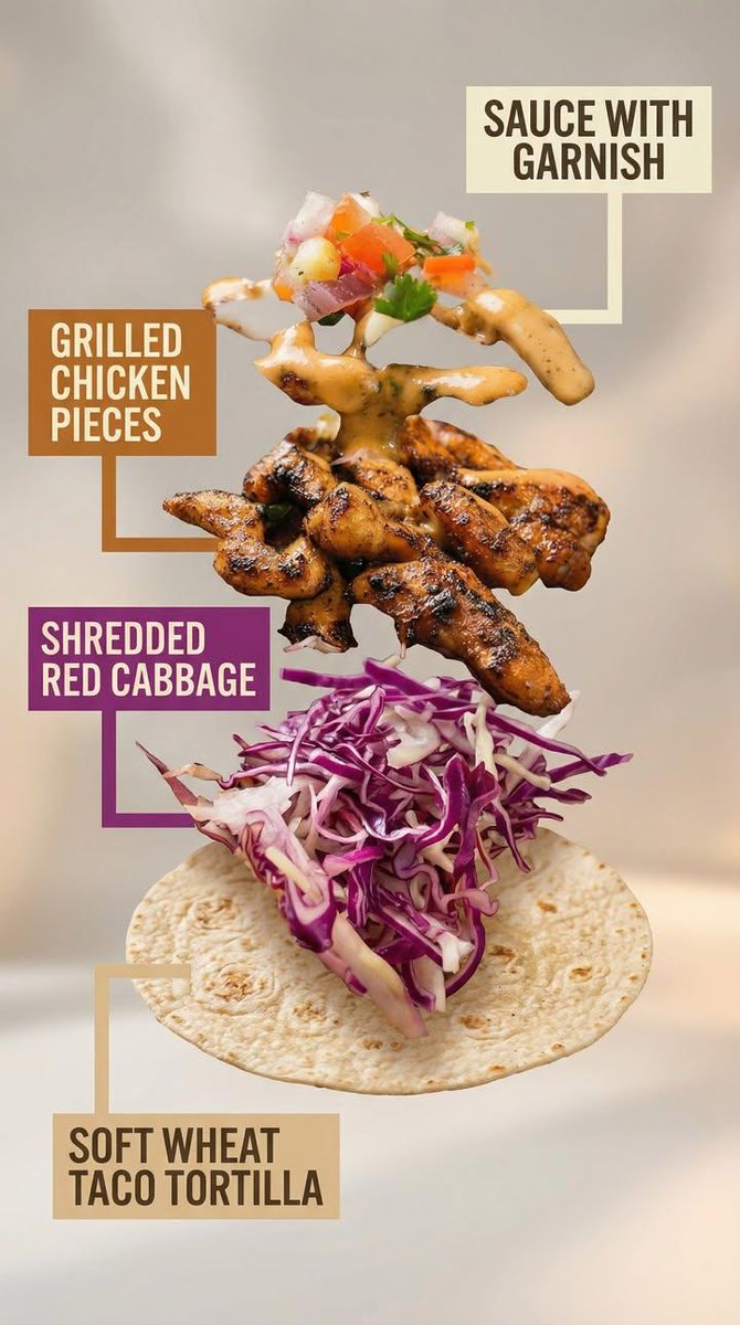
图像 2:对图中塔可的爆炸视图商业展示,以高级菜谱式拆解呈现。
该塔可被拆解为四种可见成分,精确匹配原始塔可的构成、颜色和质地。不包含额外成分。
成分被分离并在垂直堆叠中排列,自下而上均匀间隔,悬浮就位,排列精确对齐和对称。
成分顺序(从下到上):
软小麦塔可薄饼
切丝红甘蓝
烤鸡块
酱汁与点缀(顶部放一小撮混合点缀,由切丁的洋葱、番茄和欧芹组成,总计约5–6个小方丁,轻度混合,自然地放置在顶部)
每种成分在视觉上都应清晰可辨,形状与质地一目了然。
标注设计要求:
– 大号、粗体无衬线字体,在信息流尺度下也具备高可读性
– 每个标注置于实心或略带圆角的矩形色块内
– 每个色块的背景色需与对应成分颜色微妙呼应(番茄红、莴苣绿、肉类暖棕、酱汁白/奶油色、面饼米色)
– 高对比度文字(亮底深字或暗底浅字)
– 粗实、干净的连接线清晰指向每个成分
– 不使用降低可读性的透明效果
– 注释在视觉上必须优于背景但不得遮挡食材
背景应柔和、中性、有氛围,带微妙纵深和柔和渐变,灵感来源于高端食品广告。
整体风格干净、现代、诱人,具备商业可用性,不带技术或示意图式的感觉。
不添加额外元素,不替换,不重新诠释成分。
🎨 英文提示词
A high-end commercial food photograph of the same two tacos from the reference image, preserving their exact structure, fillings, proportions, and arrangement. The camera angle is slightly adjusted to a more flattering three-quarter close-up, enhancing depth and appetite appeal without altering the tacos themselves. Soft cinematic lighting highlights the textures of the tortillas and fillings, with subtle steam and natural sheen to emphasize freshness. The background is replaced with a clean, modern, out-of-focus setting in warm complementary tones that enhance the food without distracting from it. Shallow depth of field, crisp focus on the tacos, rich contrast, natural colors, and premium restaurant advertising quality. No added or removed ingredients, refined composition, lighting, and environment.
Image 2: Exploded-view commercial visualization of the taco from the image, presented as premium recipe-style breakdown.
The taco is deconstructed into four visible ingredients, matching the original taco precisely in composition, color, and texture. No additional ingredients.
The ingredients are separated and arranged in a clean vertical stack, evenly spaced from bottom to top, floating in place with precise alignment and symmetry.
Ingredient order (bottom → top):
Soft wheat taco tortilla
Shredded red cabbage
Grilled chicken pieces
Sauce with garnish (topped with a small mixed garnish of diced onion, tomato, and parsley, approximately 5–6 small cubes total, lightly mixed, placed naturally on top)
Each ingredient is visually distinct and clearly readable in shape and texture.
Annotation design requirements:
– Large, bold sans-serif font, high legibility at feed scale
– Each annotation placed inside a solid or softly rounded rectangular color block
– Background color of each block corresponds subtly to the ingredient color (tomato red, lettuce green, meat warm brown, sauce white/cream, pita beige)
– High contrast text (dark on light, light on dark)
– Thick, clean connector lines pointing clearly to each ingredient
– No transparency that reduces readability
– Annotations must visually dominate over background without covering ingredients
Background is soft, neutral, and atmospheric, with subtle depth and gentle gradients, inspired by premium food advertising.
Overall style is clean, modern, and appetizing, commercial-ready without technical or schematic feel.
No extra elements, no substitutions, no reinterpretation of ingredients.
📷 图片