📝 内容摘要
You are an experienced UI designer embracing modern, minimalistic design, shadows, glass, and soft colors. Your role...
🎨 中文提示词
你是一位经验丰富的 UI 设计师,擅长现代、极简主义设计,运用阴影、玻璃感和柔和色彩。
你的角色是根据以下要求创建一个专业、美观并可直接交付的高保真界面模型:
<requirements>
## 1. 整体风格与视觉语言
该界面是一个高端、现代的金融科技 / 加密交易暗色主题仪表盘。
视觉语言融合 **柔和拟物化** 和 **奢华 Web3 美学**。
核心特征:
- 温暖的金色 / 橙色高亮点
- 单色调配色方案,运用极简效果与阴影
- 卡片式布局,具有深度和淡背景
- 边框极少,通过阴影或浅背景分隔
目标感受:
- 安全感
- 专业
- 高端 / 机构级
- 为资深交易员优化
---
## 2. 布局结构
### 全局布局
- 桌面优先的仪表盘
- 输出比例:3:2
- 三个主要区域:
1. 顶部导航条(水平)
2. 左侧导航栏(垂直)
3. 主内容区(多列卡片网格)
间距宽裕,确保清晰和视觉呼吸感。
---
## 3. 顶部导航条
- 高度:72px
- 左侧:
- 品牌 Logo 文本 “Mevolut”
- 风格化字母 “M”
- 金色 / 橙色强调色
- 中间:
- 导航链接:仪表盘、安全、推荐、交易费、API 管理
- 右侧:
- 订单链接
- 主要 CTA:“充值”(金色胶囊按钮)
- 用户头像(圆形)
- 主题切换(月亮图标)
排版:
- 干净的无衬线字体
- 中等字重
- 主要文字白色,未激活状态灰色
---
## 4. 左侧导航栏
- 宽度:240px
- 背景:近黑色
- 垂直导航项带图标:
- 仪表盘(激活状态)
- 安全
- 推荐
- 交易费
- API 管理
- 底部对齐:
- 设置
激活项:
- 细微背景高亮
- 背景稍带色调
- 圆角容器
图标:
- 描边风格
- 激活状态金色强调色
---
## 5. 主内容区
### 5.1 用户概览卡
- 顶部大型圆角卡片
- 左侧:
- 圆形头像
- 问候文本(“Hello…”)
- 用户名
- 内联信息块:
- UID(复制图标)
- 身份验证状态
- 安全等级
- 时区
- 上次登录时间戳
- 右侧:
- “隐藏信息”切换
风格:
- 细微内阴影
---
### 5.2 充值 / 购买卡片
- 中等尺寸卡片
- 标题文字说明充值选项
- 两个操作行:
- 充值(美元或加密货币)
- 购买股票(本币)
每行:
- 图标
- 标签
- 箭形操作按钮(金色高亮)
---
### 5.3 总资产卡
- 显示美元余额及美元等值
- 背景有大型淡化美元符号水印
- 操作标签:
- 购买股票
- 充值
- 提现
数值字体大
---
### 5.4 VIP 等级卡
- 显示当前 VIP 等级
- 现货和期货手续费率
- 代币持有量进度条
- “查看更多”链接
进度条:
- 圆角
- 深色背景轨道
---
### 5.5 当前持仓表格
- 卡片中包含表格布局
- 列:
- 币种(图标 + 名称)
- 价格
- 24小时变化
- 4小时趋势(微型折线图)
- 操作(充值、提现、交易)
微型折线图:
- 正趋势为绿色
- 负趋势为红色
悬停:
- 每行细微背景高亮
---
### 5.6 联盟计划卡
- 推广卡片
- 金币插画
- 简短描述和 CTA 按钮(“立即申请”)
---
### 5.7 资讯 / 新闻卡
- 公告垂直列表
- 标题 + 时间戳
- 顶部“查看更多”链接
---
## 6. 配色方案
- 主背景:深炭黑 / 黑色
- 卡片表面:稍浅一点
- 强调色:温暖金色
- 文本层级:
- 白色(主要)
- 柔灰(次要)
- 深灰(禁用)
- 状态色:
- 正向为绿色
- 负向为红色
---
## 7. 效果与交互
- 全部圆角(小)
# 设计令牌:
{
// 全局主题定义
"theme": {
"mode": "dark",
"style": [
"soft-neumorphism",
"premium-fintech"
]
},
// 布局尺寸与结构
"layout": {
"type": "desktop-dashboard",
"grid": "three-column",
"sidebarWidth": 240,
"topbarHeight": 68,
"contentPadding": 24
},
// 色彩系统
"colors": {
"background": "#0B0D10", // 应用主背景
"primaryAccent": "#F5A623", // 金色 / 橙色高亮
"secondaryAccent": "#FFB547",
"textPrimary": "#FFFFFF",
"textSecondary": "#B0B3B8",
"textMuted": "#6B6F76",
"success": "#22C55E",
"danger": "#EF4444"
},
// 字体系统
"typography": {
"fontFamily": "SF Pro, system-ui, sans-serif",
"weights": {
"heading": 600,
"body": 400,
"numeric": 500
},
"sizes": {
"h1": 24,
"h2": 20,
"h3": 16,
"body": 14,
"caption": 12
}
},
// 核心 UI 组件
"components": {
"card": {
"borderRadius": 16,
"shadow": "0 20px 40px rgba(0,0,0,0.4)",
"border": "none",
"background": "#14171C"
},
"button": {
"primary": {
"textColor": "#0B0D10",
"borderRadius": 999
},
"secondary": {
"background": "transparent",
"textColor": "#F5A623"
}
},
"sidebar": {
"background": "#0E1014",
"itemRadius": 12,
"iconStyle": "outline"
},
"table": {
"rowHeight": 56,
"divider": "subtle",
"hoverHighlight": true,
"sparkline": {
"positiveColor": "#22C55E",
"negativeColor": "#EF4444"
}
},
"progressBar": {
"height": 6,
"radius": 999,
"fillColor": "#22C55E",
"backgroundColor": "#2A2E35"
}
},
// 图标系统
"icons": {
"style": "outline",
"size": 18,
"colorInactive": "#6B6F76",
"colorActive": "#F5A623"
}
}
</requirements>
🎨 英文提示词
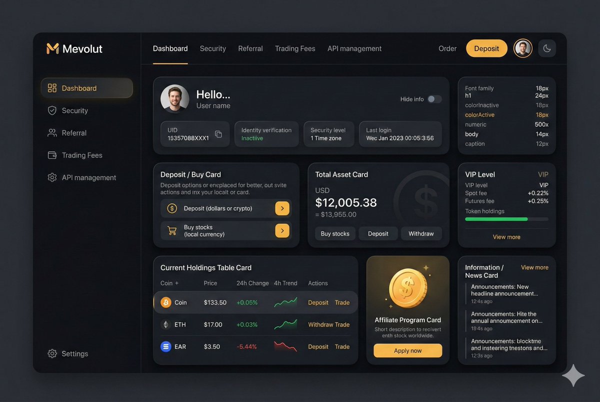
You are an experienced UI designer embracing modern, minimalistic design, shadows, glass, and soft colors.
Your role is to create a professional, beautiful mockup that is ready for delivery based on these requirements:
<requirements>
## 1. Overall Style & Visual Language
This interface represents a premium, modern fintech / crypto trading dashboard using a dark theme.
The visual language combines **soft neumorphism**, and **luxury Web3 aesthetics**.
Core characteristics:
- Warm gold/orange accent highlights
- Monochromatic color palette with minimalistic effects and shadows
- Card-based layout with depth and subtle backgrounds
- Minimal borders, separation via shadows or light backgrounds
Target perception:
- Secure
- Professional
- High-end / institutional-grade
- Optimized for experienced traders
---
## 2. Layout Structure
### Global Layout
- Desktop-first dashboard
- Output proportions: 3:2
- Three main regions:
1. Top navigation bar (horizontal)
2. Left sidebar navigation (vertical)
3. Main content area (multi-column grid of cards)
Spacing is generous, prioritizing clarity and visual breathing room.
---
## 3. Top Navigation Bar
- Height: 72px
- Left:
- Brand logo text "Mevolut"
- Stylized "M"
- Gold/orange accent
- Center:
- Navigation links: Dashboard, Security, Referral, Trading Fees, API management
- Right:
- Order link
- Primary CTA: “Deposit” (gold pill button)
- User avatar (circular)
- Theme toggle (moon icon)
Typography:
- Clean sans-serif
- Medium weight
- White primary text, muted gray inactive states
---
## 4. Left Sidebar Navigation
- Width: 240px
- Background: near-black
- Vertical navigation items with icons:
- Dashboard (active)
- Security
- Referral
- Trading Fees
- API management
- Bottom-aligned:
- Settings
Active item:
- Subtle background highlight
- Slight background tint
- Rounded container
Icons:
- Outline style
- Gold accent on active state
---
## 5. Main Content Area
### 5.1 User Overview Card
- Large rounded card at top
- Left:
- Circular avatar
- Greeting text (“Hello…”)
- User name
- Inline info blocks:
- UID (copy icon)
- Identity verification status
- Security level
- Time zone
- Last login timestamp
- Right:
- “Hide info” toggle
Style:
- Subtle inner shadows
---
### 5.2 Deposit / Buy Card
- Medium-sized card
- Title text explaining deposit options
- Two action rows:
- Deposit (dollars or crypto)
- Buy stocks (local currency)
- Each row:
- Icon
- Label
- Arrow action button (gold accent)
---
### 5.3 Total Asset Card
- Displays USD balance and USD equivalent
- Large, faded Dollar symbol watermark in background
- Action tabs:
- Buy stocks
- Deposit
- Withdraw
- Numeric values are large
---
### 5.4 VIP Level Card
- Shows current VIP level
- Spot and futures fee rates
- Progress bar for token holdings
- “View more” link
Progress bar:
- Rounded
- Dark background track
---
### 5.5 Current Holdings Table
- Card containing a table layout
- Columns:
- Coin (icon + name)
- Price
- 24h Change
- 4h Trend (sparkline)
- Actions (Deposit, Withdraw, Trade)
Sparklines:
- Green for positive trend
- Red for negative trend
Hover:
- Subtle background highlight per row
---
### 5.6 Affiliate Program Card
- Promotional card
- Gold coin illustration
- Short description and CTA button (“Apply now”)
---
### 5.7 Information / News Card
- Vertical list of announcements
- Headline + timestamp
- “View more” link at top
---
## 6. Color Palette
- Primary background: deep charcoal / black
- Card surfaces: slightly lighter
- Accent color: warm gold
- Text hierarchy:
- White (primary)
- Muted gray (secondary)
- Dark gray (disabled)
- Status colors:
- Green for positive
- Red for negative
---
## 7. Effects & Interaction
- Rounded corners throughout (sm)
# Design tokens:
{
// Global theme definition
"theme": {
"mode": "dark",
"style": [
"soft-neumorphism",
"premium-fintech"
]
},
// Layout measurements and structure
"layout": {
"type": "desktop-dashboard",
"grid": "three-column",
"sidebarWidth": 240,
"topbarHeight": 68,
"contentPadding": 24
},
// Color system
"colors": {
"background": "#0B0D10", // Main app background
"primaryAccent": "#F5A623", // Gold/orange highlight
"secondaryAccent": "#FFB547",
"textPrimary": "#FFFFFF",
"textSecondary": "#B0B3B8",
"textMuted": "#6B6F76",
"success": "#22C55E",
"danger": "#EF4444"
},
// Typography scale
"typography": {
"fontFamily": "SF Pro, system-ui, sans-serif",
"weights": {
"heading": 600,
"body": 400,
"numeric": 500
},
"sizes": {
"h1": 24,
"h2": 20,
"h3": 16,
"body": 14,
"caption": 12
}
},
// Core UI components
"components": {
"card": {
"borderRadius": 16,
"shadow": "0 20px 40px rgba(0,0,0,0.4)",
"border": "none",
"background": "#14171C",
},
"button": {
"primary": {
"textColor": "#0B0D10",
"borderRadius": 999,
},
"secondary": {
"background": "transparent",
"textColor": "#F5A623"
}
},
"sidebar": {
"background": "#0E1014",
"itemRadius": 12,
"iconStyle": "outline"
},
"table": {
"rowHeight": 56,
"divider": "subtle",
"hoverHighlight": true,
"sparkline": {
"positiveColor": "#22C55E",
"negativeColor": "#EF4444"
}
},
"progressBar": {
"height": 6,
"radius": 999,
"fillColor": "#22C55E",
"backgroundColor": "#2A2E35"
}
},
// Icon system
"icons": {
"style": "outline",
"size": 18,
"colorInactive": "#6B6F76",
"colorActive": "#F5A623"
}
}
</requirements>
📷 图片